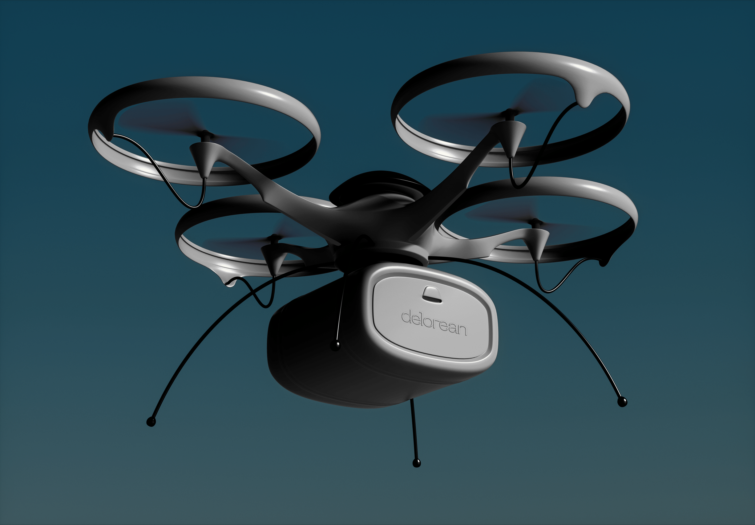
delorean.
In the project assignment, I had to revive a dead or dying brand. The DeLorean was a car made by the DeLorean Motor Company in 1975. The company didn’t advance with the times and eventually stopped all operations. With modern advancements in technology, we are at the forefront of the future. I saw great potential in this brand as the change for transportation.
The Problem.
The DeLorean Motor Company had failed to recoup its $175 million in investment costs. Unsold cars were accumulating and the company was in dire financial straits. In October 1982, DeLorean was charged with cocaine trafficking. The trial ended in a not guilty verdict in August 1984, by which time DMC had declared bankruptcy and shut down.
The Objective.
The first objective of this project was to revive DeLorean and reposition the brand to compete in today’s transportation industry. The second objective is to cause a rift within our current infrastructure by redefining the cost of living through transportation.
Process & Background
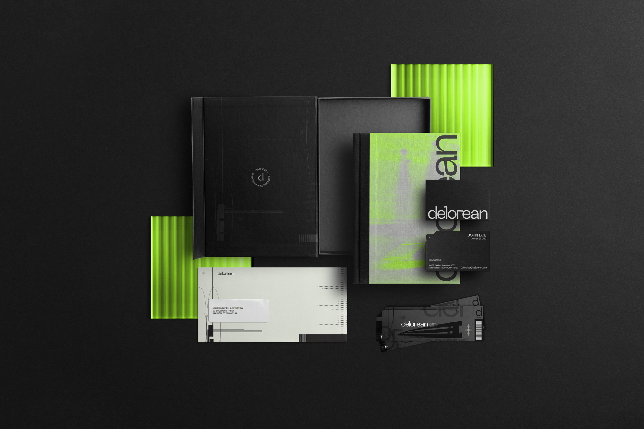
During this brand revival, I pulled inspiration from the contemporary and stark aesthetic of bold abstract forms found in brutalist and modern architecture. The ink traps are to foreshadow the impression delorean will leave. Through these ink traps, I took the width of the inner angle for the kerning to create tension between the letterforms and show calculation and attention to detail. The wordmark is lowercase because I don’t want any commonalities between the old brand and the brand revival. Though lowercase may come across as passive, the intention was to create a wordmark that can hold its own while also speaking to a broad audience.
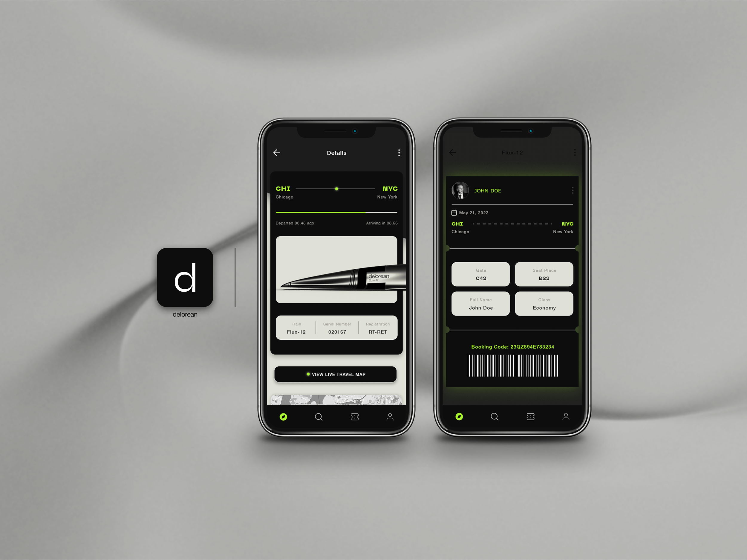
Our Audience - The target audience for delorean is a group of individuals that are invested in technology advancement with a busy, fast-paced lifestyle.
Tone of Voice - Our tone of voice stems from the rebel archetype that delorean embodies. Through all channels, we are honest, straightforward, steadfast, serious, deliberate, calculated, realistic, active, and unflinching.
Prototypes.
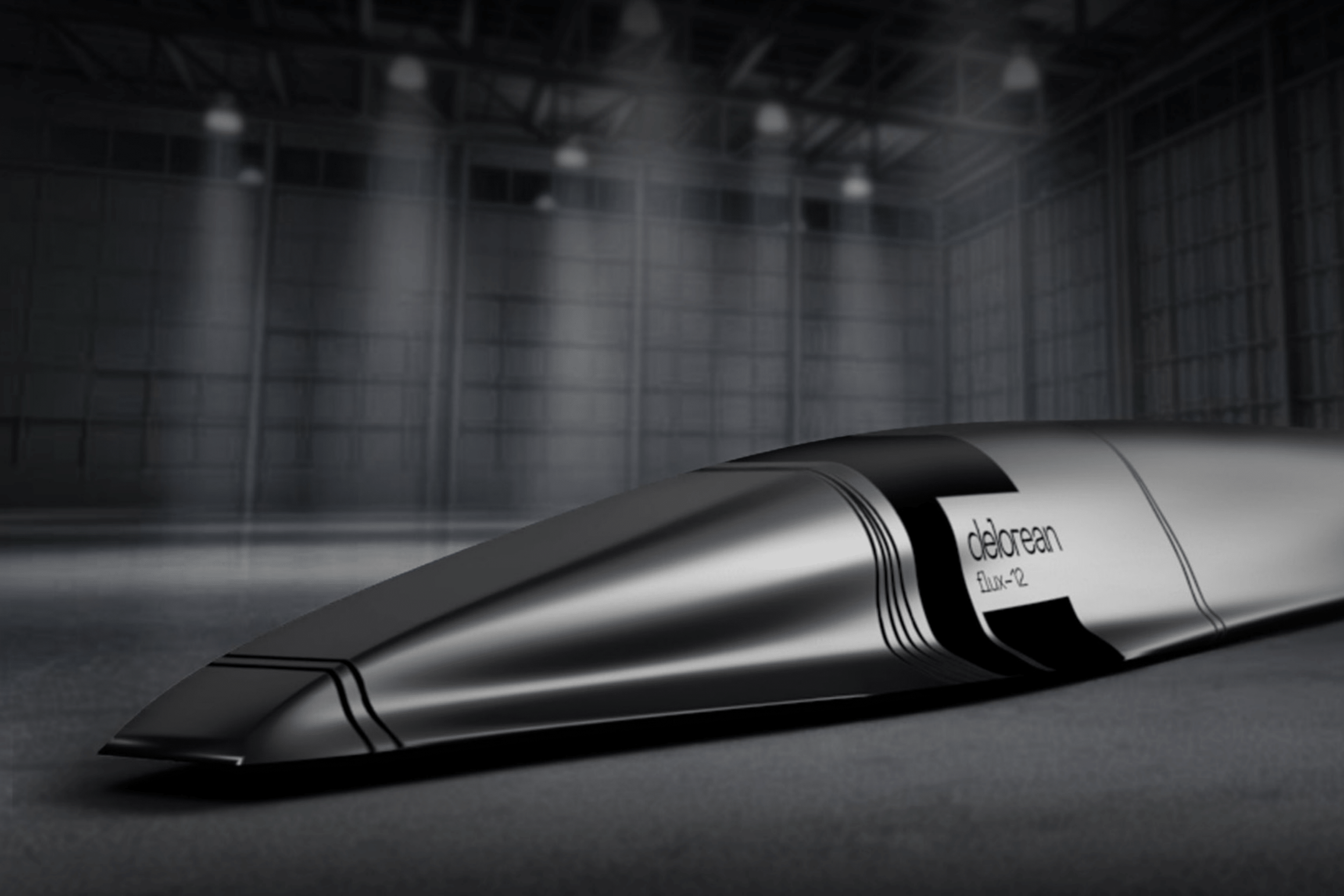
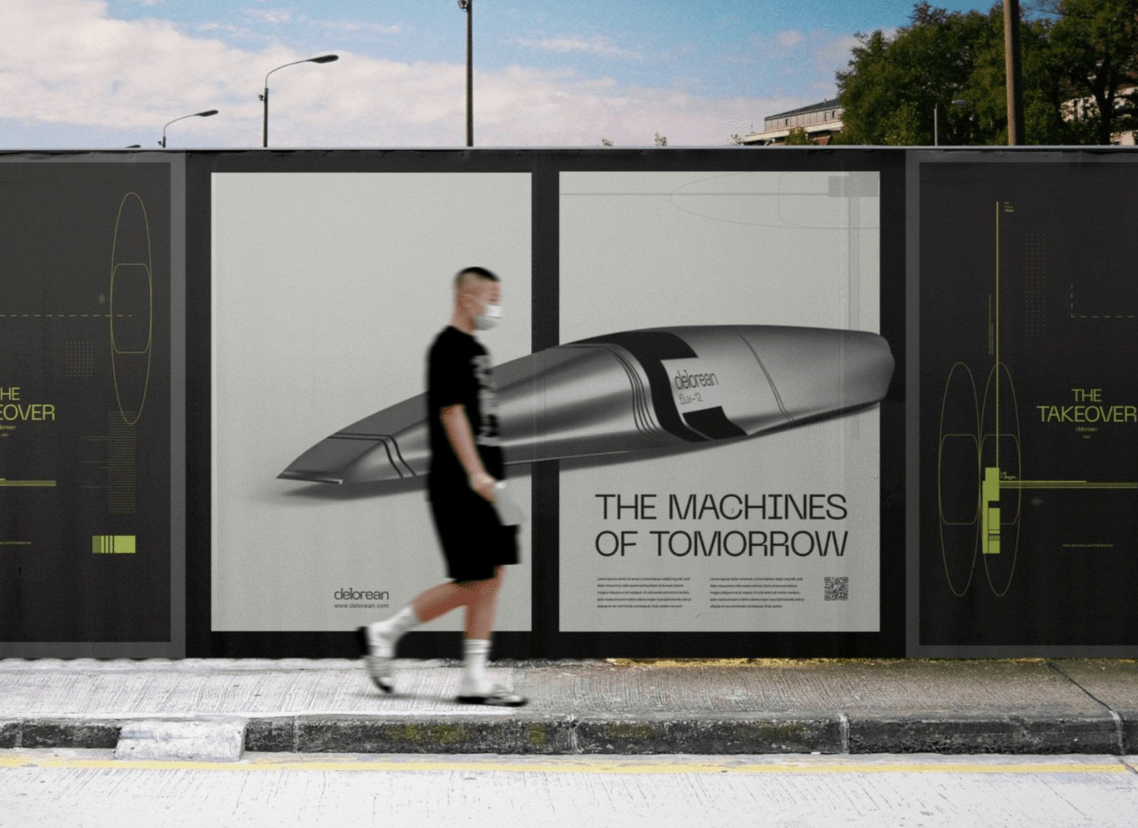
These prototypes were built in Blender and Adobe Dimension. The stainless steel is a nod to what delorean is known for, but it has been repurposed and updated with other graphics to set it apart from the old look. As I was doing research, I found that the few Hyperloop trains that are in development all look very similar to one another. By having a stainless steel outer shell, it ruffles the feathers and makes delorean stand out amongst the rest. I took aerodynamics into consideration when building the shape of the flux-12. The train has a pointed nose so that the airflow would scoop over the top, resulting in a small amount of drag while gliding through the tunnel.
As I began designing this prototype, I studied how birds’ wings wrap around their body as they descend from the sky. Through observation, I noticed each of these birds has stood the test of time and has evolved. I asked myself, What can we learn from them? How how can we implement this into a product? Through many rounds of sketching and deconstructing hyper-fast machines, I concluded the pointed nose and rounded sides would be the most successful design for the flux-12.
My Learnings
Throughout this project, I learned how to think outside the box and completely transform a brand within the same market in order to intrigue consumers. I also taught myself how to use Blender and create a 3D model of a product I designed from scratch. This project taught me how to push beyond my comfort zone.

